
Bitcoin
Bitcoin CPI
Venture Portfolio
Funds
Market Insights
Indicators
About
Contact

March 25, 2024


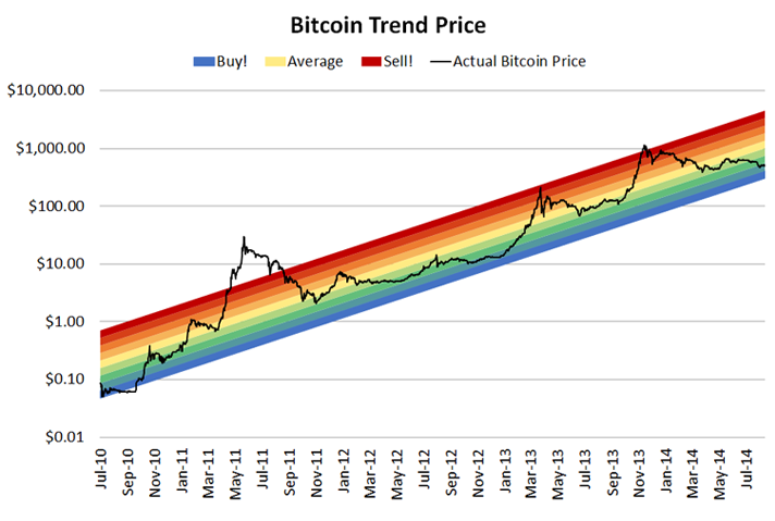
Several Bitcoin price indicators have emerged from previous market cycles, with the Bitcoin Rainbow Chart arguably being one of the most popular.
Read on to find out how the Bitcoin Rainbow Chart was created, its association with the HODL acronym, and whether it is a valuable indicator for analyzing the price of Bitcoin.
The Bitcoin Rainbow Chart is a visual indicator that uses the colors of the rainbow to indicate whether an investor should buy or sell Bitcoin.
It’s currently being displayed on the Blockchain Center. However, the website owners make sure to tell you that the Bitcoin Rainbow Chart is not investment advice!

The Bitcoin Rainbow Chart emerged as a joke in the early days of the 2014 bear market. The Mt.Gox hack and its aftermath had just happened, and hardcore Bitcoin HODLers gathered on the Bitcoin Talk Forum and the r/Bitcoin Subreddit.
Bear in mind this was during a time when Bitcoin was even more volatile than today.
The market could swing 20% in either direction within a day, and this time around, the trend was downward. However, this didn’t hold back the core of the Bitcoin community, and most of them gathered online to help each other out.
One day, a post on Reddit emerged with the Bitcoin Rainbow Chart by the user “azop.” The chart showed the Bitcoin price on a log scale with the famous rainbow color bands. It’s a simplified version of today's chart (above), as some colors are missing. Nonetheless, the Bitcoin Rainbow Chart was born, and it quickly emerged from a meme post into a simplified indicator people would use.
The Bitcoin Rainbow Chart is a log chart with nine colors and a simple concept: act if the price moves into a specific color.
The nine colors are:
The Bitcoin Rainbow Chart also shows the Bitcoin halvings with the years across the x-axis and the Bitcoin price in U.S. dollars across the y-axis.
This legendary chart with all the colors is here for investors to simplify their buying or selling decisions. To maximize your profits (in theory), you want to buy Bitcoin at the Blue (A Fire Sale) level and hold it until the Red (Maximum Bubble Territory) level.
However, there is also a middle ground for hardcore Bitcoin enthusiasts.
The yellow level (HODL) is associated with the famous HODL acronym, which emerged from the Bitcoin Rainbow Chart just a year ago.
Several vocal voices within the Bitcoin community use the Bitcoin Rainbow Chart to prove their point that HODLing Bitcoin over time is more effective than trying to time the market.
The Bitcoin Rainbow Chart was first published by the Reddit user “azop” on the r/Bitcoin Subreddit in 2014.
The original Bitcoin Rainbow Chart had not bowed yet, mainly because of the digital currency's young age, but the more the asset matured and the price increased, the more the Bitcoin Rainbow Chart started bowing.
Because Bitcoin was highly volatile in the early days, azop used the log scale and a less dramatic look, especially with smaller outbreaks in both directions, to boost morale. The colors and different levels are an easy way of understanding when to potentially buy Bitcoin.
Azop quickly emerged as the “Rainbow Chart Guy” and was a glimmer of hope in an intense bear market.
Throughout the following months, he regularly posted updates to the Bitcoin Rainbow Chart, which gained a popular following.
However, throughout the next bull market in 2017, the chart lost popularity, and it wasn’t until 2019 that Eric Wall mentioned it in various X (formerly Twitter) posts. Holger Rohm, the Blockchain Center owner, also became interested in the Bitcoin Rainbow Chart.
He improved the chart slightly, mainly changing it from an exponential presentation to the bowed version we see today. Rohm was interested in offering a better experience and having an opposing voice to the complex chart analysis investors would often read on social media.
The Blockchain Center is very vocal about the fact that the Bitcoin Rainbow Chart is not investment advice, and it should be used as a meme on social media and not an indicator for chart analysis.
The idea behind the Bitcoin Rainbow Chart is to spread hope in times of trouble.
Remember, it was born during a very dark time in Bitcoin, when the price fell constantly, and the entire community needed a morale boost.
The Bitcoin Rainbow Chart was never a serious attempt to model or predict the price of Bitcoin. It has various limitations, as it does not rely on scientific or mathematical formulas. Instead, it is a fun way of displaying Bitcoin's purchasing power and market cycles.
Unlike other analysis tools, the Bitcoin Rainbow Chart simply displays the Bitcoin price over the years, and the different color levels display the bottom of the bear markets and don’t highlight specific price levels or the “best” times to buy Bitcoin.
It also has to be said that the Bitcoin Rainbow Chart displays the past, and the past is not an indicator of the future value of any asset.
The Bitcoin Rainbow Chart is a popular memorabilia from the early days of Bitcoin and has regained popularity thanks to its simplicity.
In a way, Holger Rohm achieved his goal of offering the Bitcoin Rainbow Chart as a morale boost and indicator of Bitcoin’s history. However, it should not be treated as more than that and should not be used as an analysis tool.

